TL;DR
I led the end-to-end redesign of a regional Ardo e-commerce website to improve product discovery and align the platform with global brand standards. By conducting a UX audit and rebuilding the information architecture, I reduced navigation complexity and created a scalable design system that balanced usability, brand consistency, and technical constraints.
Curious to know more? Scroll down for the details…
The Challenge
brand & credibility
Ardo is a Swiss-based breastfeeding & medical tech company. Ardo's Israel local distributor was losing credibility and sales opportunities. The website looked nothing like Ardo's Swiss brand—undermining trust and failing to establish legitimacy as the official Israeli franchiser. Meanwhile, mothers and healthcare professionals struggled to find products through cluttered pages, poor filtering, and confusing navigation.
research & discovery
bug or a feature?
I conducted stakeholder interviews with the local distributors to understand market-specific needs and validate feature priorities. These sessions revealed critical insights—like the importance of direct WhatsApp communication in Israel's customer service culture—that shaped feature decisions and ensured the design served real business and user contexts.

solution
what i delivered
As the sole UX/UI designer, I transformed the site into a credible, user-friendly digital presence.
Important constraints to work along with, was the legacy infrastructure: the site was build in Elementor and had to stay this way. This required me to get familiar with Elementor's capabilities and limitations and work closely with the devs.
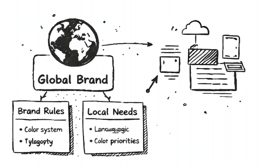
Brand alignment from scratch
Translated Ardo's global brand guidelines into a complete styleguide and responsive design system in Figma, establishing visual credibility as the official distributor

Streamlined navigation
Redesigned the information architecture from the ground up, reducing cognitive load and creating clear pathways based on user needs (first-time mothers vs. healthcare professionals)

Scalable, constraint-aware system
Built a modular design system that balanced WordPress limitations with custom display requirements, enabling faster future updates

impact & outcomes
Established brand credibility
Visual design now reflects Ardo's Swiss standards, legitimizing the distributor's official status
improved product discoverability
Ran sample-group user testing to confirm improved product discoverability through restructured IA and intuitive filtering
Future-proofed the design
Delivered production-ready Figma system (styleguide, responsive components, IA documentation) for seamless scaling
Future-proofed the design
Delivered production-ready Figma system (styleguide, responsive components, IA documentation) for seamless scaling
Complete delivery on schedule
All UX/UI assets shipped despite limited dev resources
reflection
insight & learniings
Implementation was paused mid-development due to resourcing changes outside my control. Design work was validated and approved for production.
The project was resumed after my contract had concluded, so I had no oversight or QA-function during implementation.
This project proved I can translate global brand standards into localized, production-ready systems under resource constraints. In future projects, I now advocate earlier for embedded design–dev pairing to catch technical blockers before handoff, not after.
One thing I sincerely regret, is not keeping screenshots of the old website - it was a real example that apparently we have not yet figured it all out when it comes to e-commerce, especially for local markets.
2026 all rights reserved
Made with love by yours truly